Minnesota Roller Derby
With inclusivity and character-building at its core, Minnesota Roller Derby is a six-team roller derby league in St. Paul, MN. I concepted and illustrated the key art, coordinated the production of print materials, and provided social media assets for a cohesive marketing campaign for their February 2019 bout.
The Brief
Minnesota Roller Derby (or MNRD, and formerly Minnesota RollerGirls, at the time of this project) holds monthly bouts, where its teams go head-to-head, progressing through the season. Each bout has a unique theme, name, and artwork accompany it. Specifically, the components needed were:
- 18″ x 24″ event posters
- screen print t-shirts
- 8.5″ x 11″ flyers
- digital and social media assets
Key Art
MNRD’s theme for their 2018–2019 season was “Larger Than Life.” With that in mind, I wanted to make a design played with a sense of scale, both big and small. After sketching around a bit and being just about to send over my concepts for review, I had that let-me-try-one-more-thing itch, and knocked out what ended up being pretty dang close to the final design.
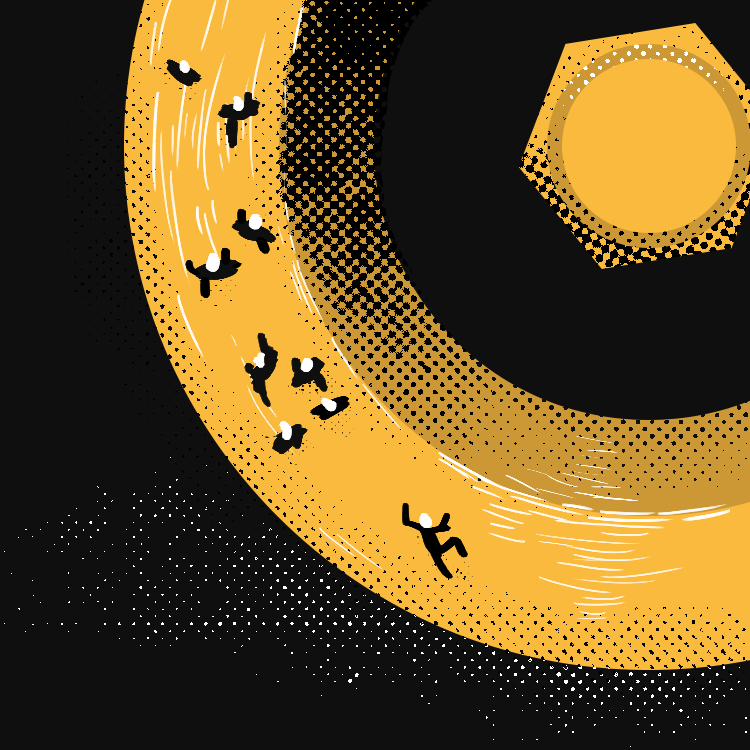
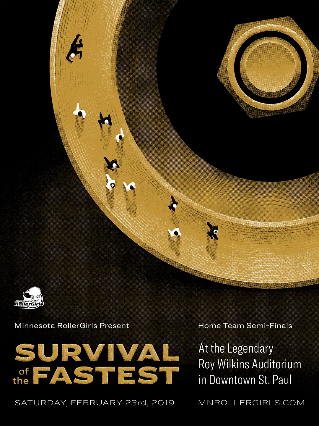
1950s–1960s design massively inspired the concept, particularly movie posters and book covers of the era. That graphic quality and bold colors were perfect for conveying the two dueling perspectives as simply as I could: the wheel and hub of a roller skate as viewed close-up from the side, and a roller derby track with skaters as viewed from high above. Illustration isn’t my forte, so I remembered that classic acronym and forced myself to keep it simple, stupid.
MNRD’s marketing and art teams loved the concept, and gave me full creative freedom to run with it. Well, with one change: make the skaters move counterclockwise. I had unknowingly already broken the second cardinal rule of roller derby:
- Go fast.
- Turn left.
So after creating the concept, settling on a name for the bout, “Survival of the Fastest”—full credit to my much more talented sibling, Katie Jo—and quadruple-checking the event details, I set to work bringing the concept to completion.
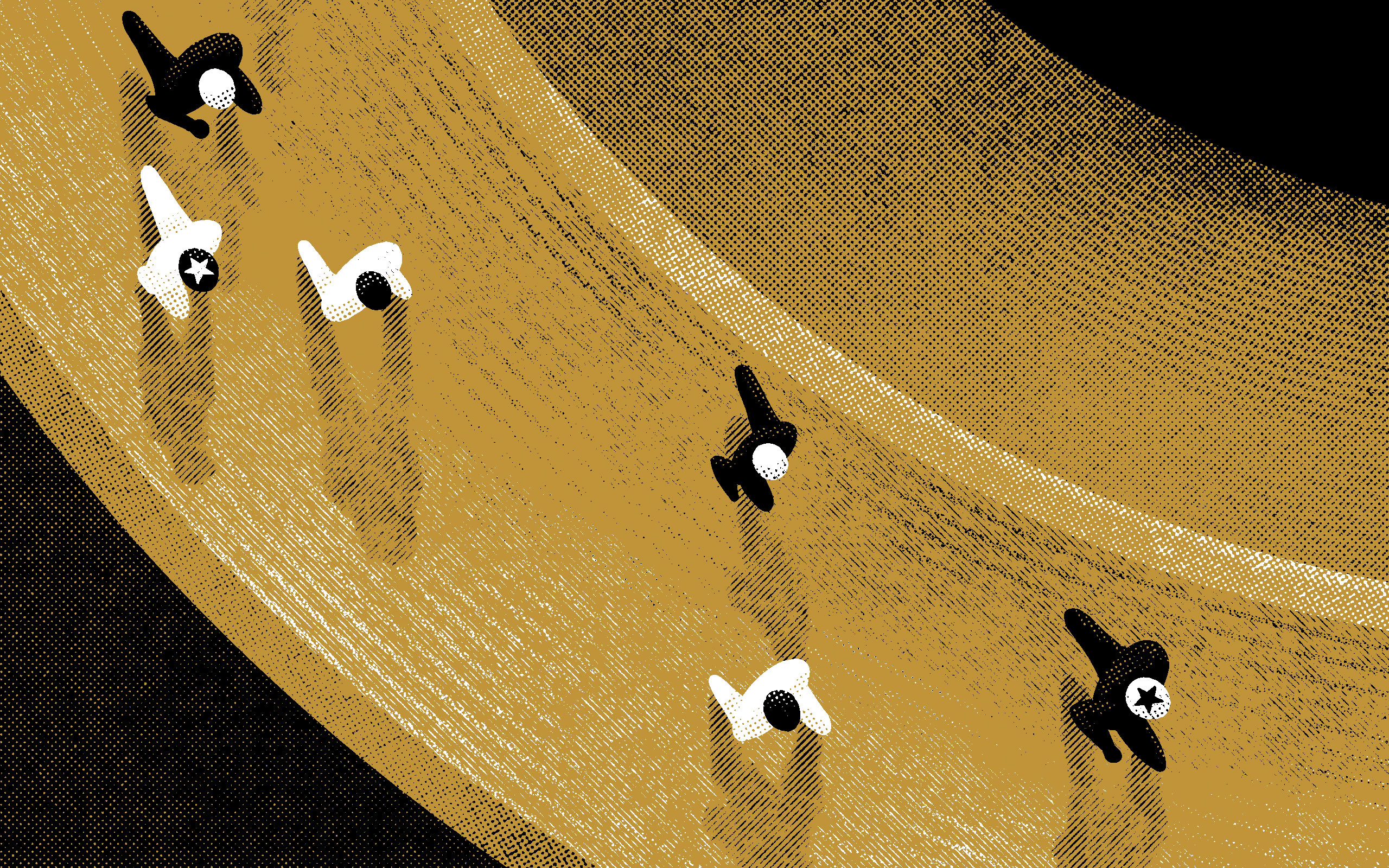
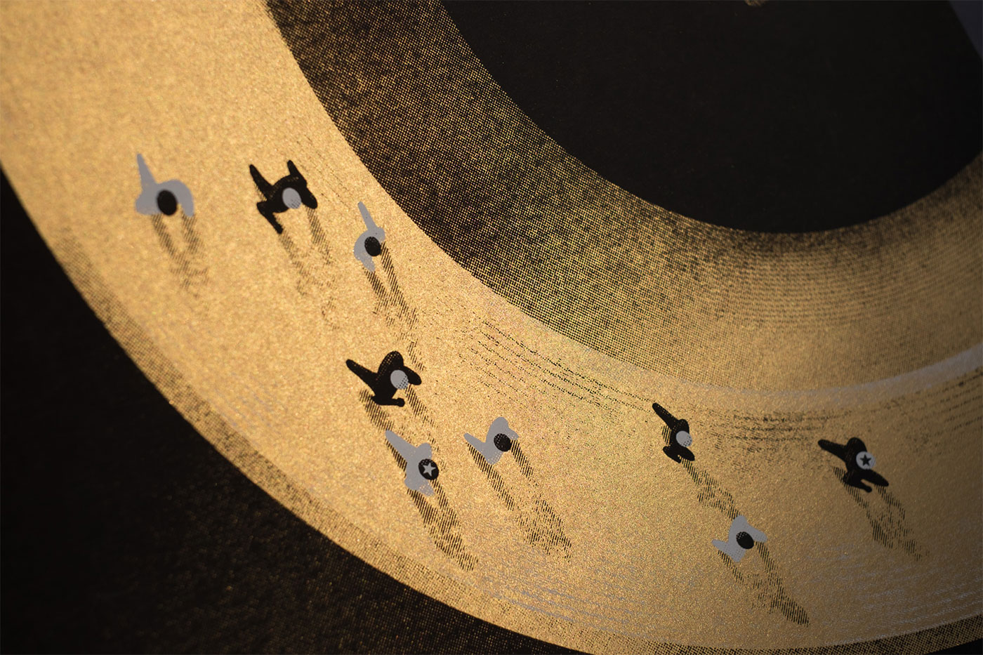
Because the physical posters were going to be 18″ x 24″, I needed to ensure a high enough level of detail while illustrating digitally. Most print shops require a minimum resolution of 300 dots-per-inch (DPI) to ensure a crisp end result. But I knew the level of detail I wanted to put into the illustration, so I doubled it and went with 600 DPI. Y’know, just in case. Overkill? Maybe. Worth the extra effort (and RAM usage)? Absolutely. The extra resolution pays off when looking at a zoomed-in view of the final artwork.
Given my influences, the distressed halftones and hatching pay homage to old, messy, mid-century screen print techniques. Everything was just a touch gritty and grimier back then, which adds a ton of warmth and character and tooth to what might’ve otherwise been a relatively staid design.
So, where to go from here? Surely, after all this work, I wasn’t going to cut corners by allowing the final posters to be printed on a cold, lifeless inkjet printer…
Screen Printed Posters
Because I had leeway to chose the print method for the event poster—and given my gritty, halftone-heavy sketch—screen printing was my first and only choice. These were going to be sold at the bout, and I wanted them to be visually surprising, textured, and ultimately worth displaying on a wall in someone’s home.
Thankfully, MNRD has working relationships with local print shops, and was able to recommend one for screen printing. I couldn’t have had a smoother experience collaborating with Max at Phenom Print Studio in Minneapolis. After discussing the project with Max, curious how we could translate the design to a screen print, we settled on the following specs for the print run:
- 2-color, black and white ink
- “Antique Gold” metallic paper, 105 lb
- Full-bleed
- 18″ x 24″
- 50 units
I might’ve bit off more than I could chew if it weren’t for Max. He’s an absolute pleasure to work with, and is just as much a teacher as he is an artist and craftsman. It was a humbling learning experience; I’d had things printed before, but never screen printing to this level of detail, with as many technical considerations, given all the distressed halftones I wanted to pack into the final design. Paper choice, trapping, color separations, ink screen order, etc, all of that. He accommodated my all of my print requests, on-time and on-budget. Total champ! I’ll absolutely be working with Phenom again in the future to sate my screen printing needs.
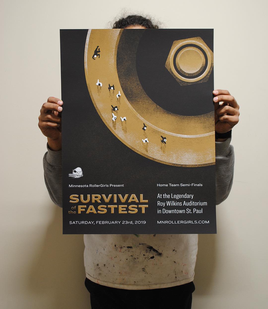
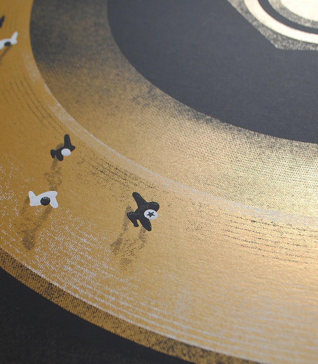
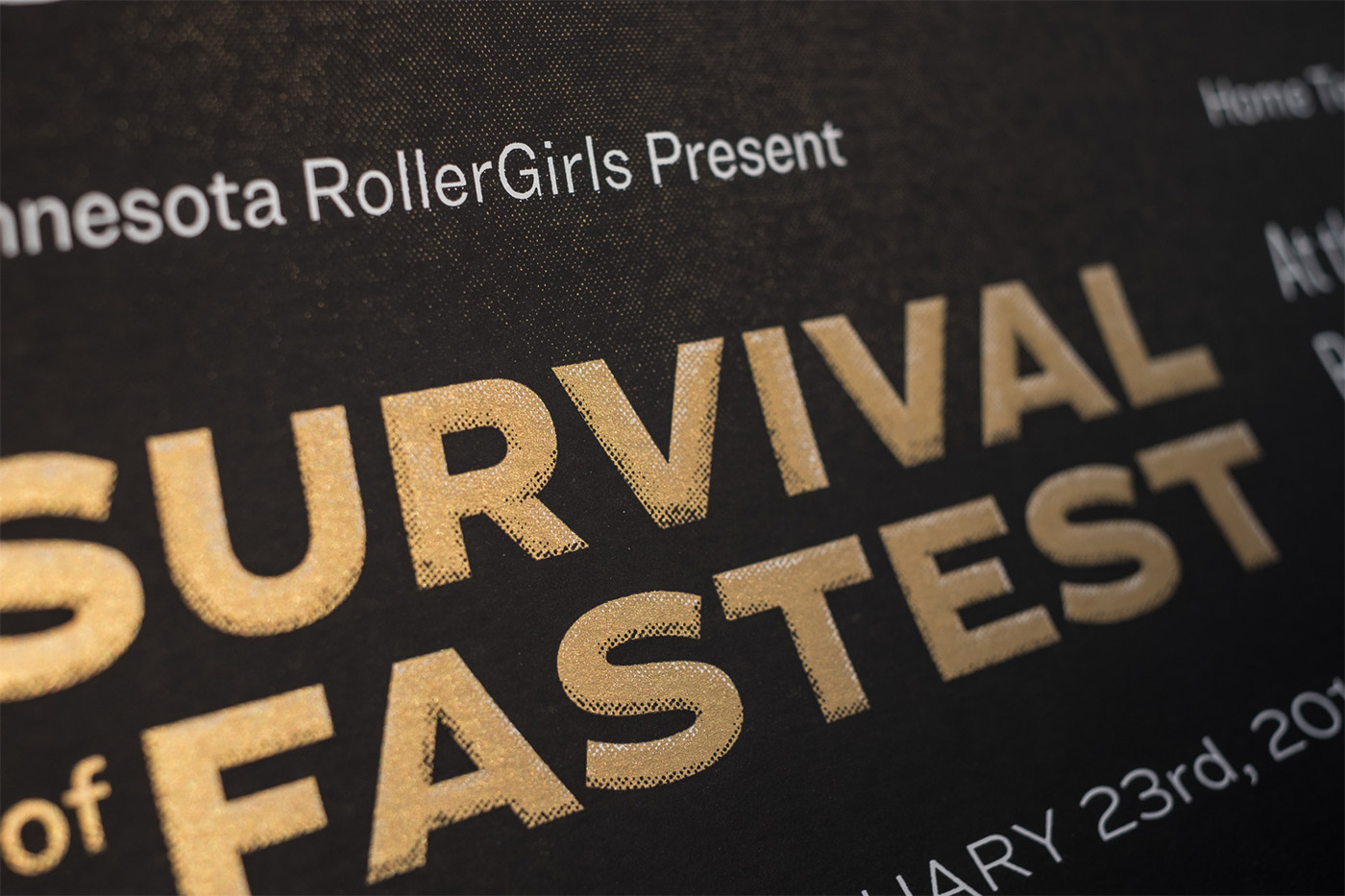
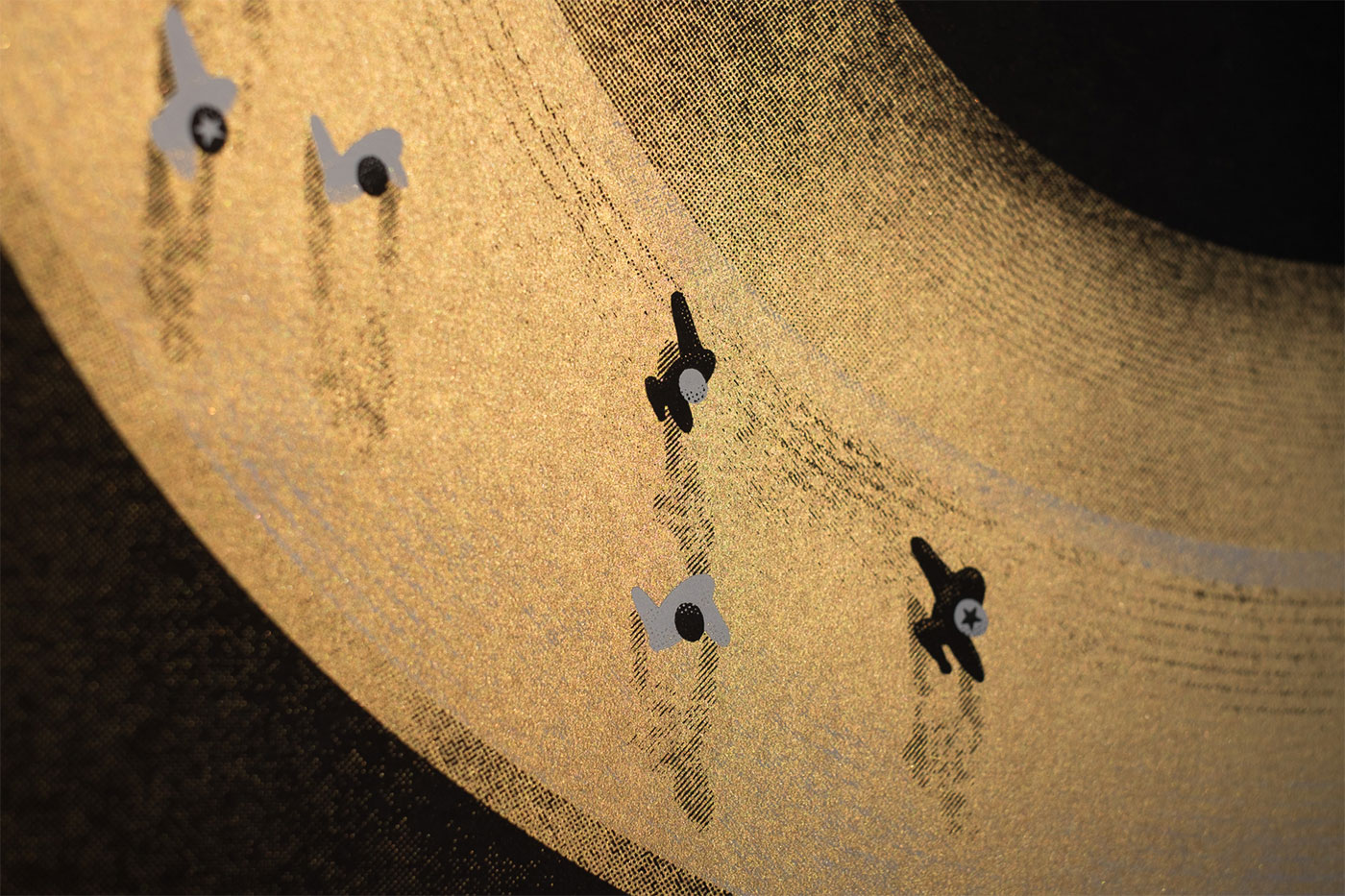
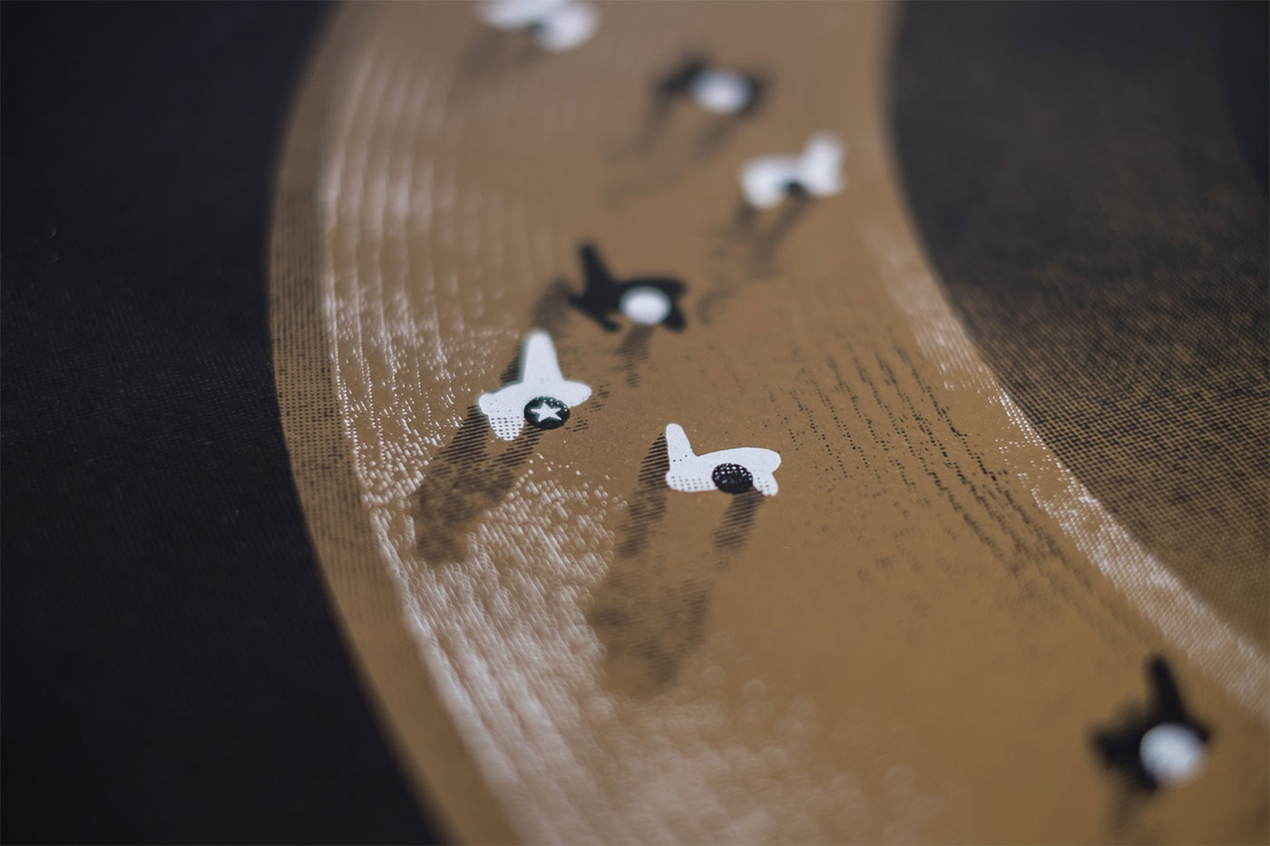
First two photos © Max Weber
The metallic gold paper catches the light depending on the angle. While I could’ve printed on a smoother and shinier gold paper, the subtle texture and sheen of the antique gold makes for an understated stunner in-person. The eye is drawn immediately to the luster of the gold wheel/track, thanks to the contrast of the matte black ink.
T-Shirts
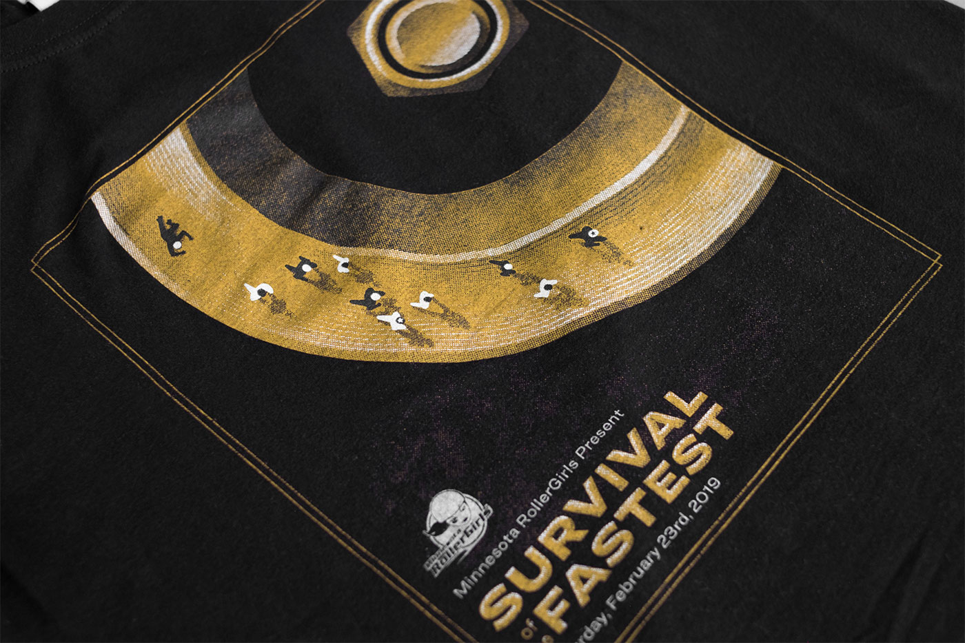
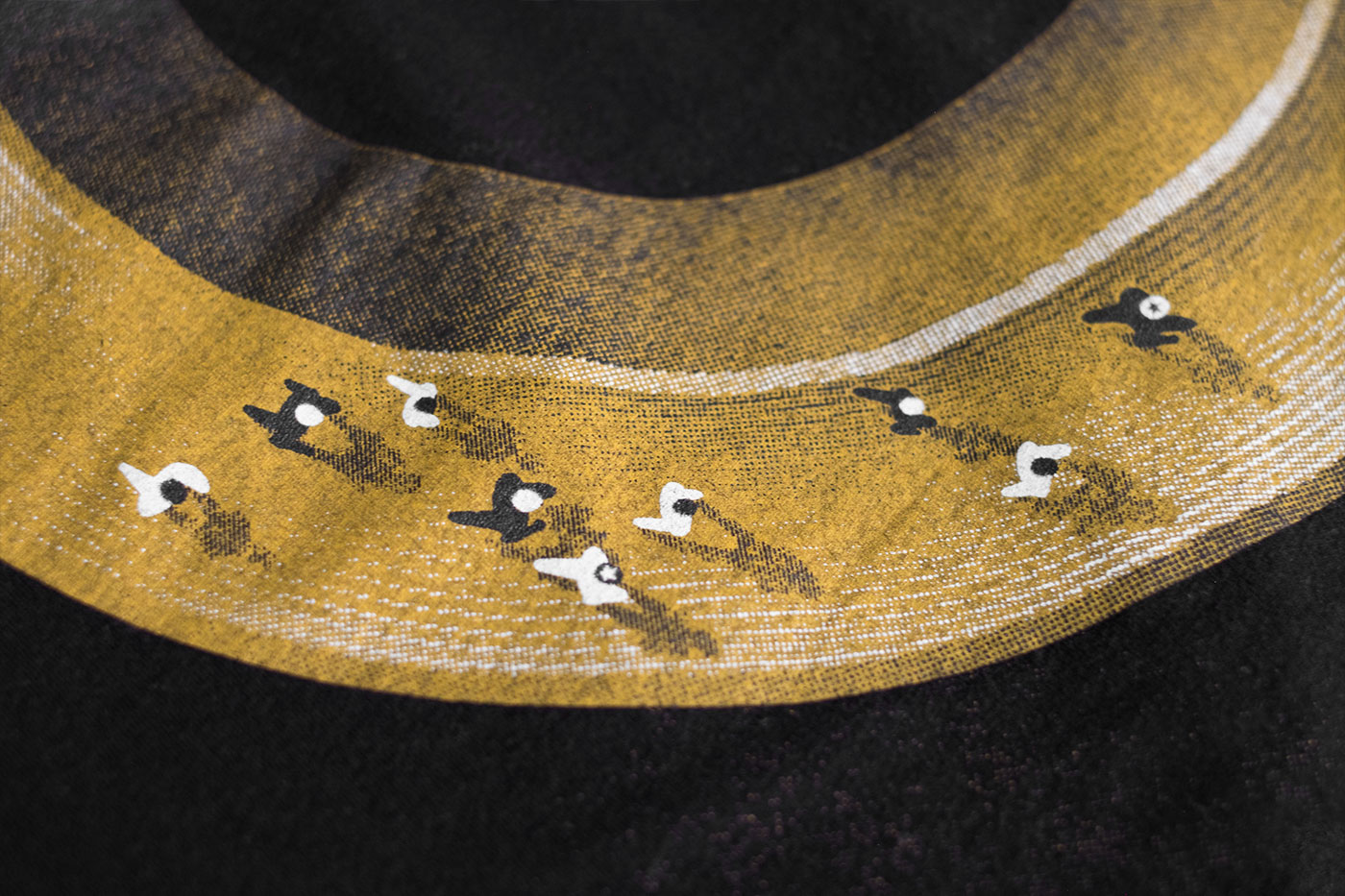
Once the poster design was squared away, I thought adapting it to make a matching screen print t-shirt design would be a cinch. Well, that’s not exactly what happened; I was so focused on the high detail poster that I hadn’t put much thought into how the crazy-distressed bitmap halftones would look once scaled down to fit on a t-shirt. And sure enough, simply scaling down the art didn’t work; the previously crisp-and-delicious bitmap halftones were now blurry and had semi-transparent pixels after being interpolated.
While I had initially considered creating the full-size art in Illustrator to help with scaling the art to various sizes, I knew I wanted to use a set of high-res, funky halftone brushes in Photoshop to give it a rough look. I don’t regret that decision, but it meant I had to essentially re-draw the art for the t-shirt, using the halftone brushes at a much lower density. Some time lost, a few lessons learned, and voilà—a matching design for t-shirts, given away to the first 200 event attendees.
Social Media Assets
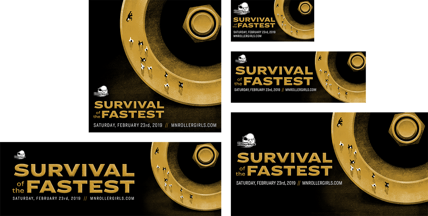
The marketing campaign also called for the creation of supplemental images for use on social media. I created additional graphics for use on Instagram, Facebook, and Twitter. Each social platform has their own image size requirements, meaning the positions of the art in relation to the text would need to be adjusted. After adjusting the key art to suit the new aspect ratios, batch exporting and handing off to MNRD, the digital component of the campaign was ready to launch in anticipation of the February 23rd bout.
